Ep.2: Photography
I’ve spent a good part of my life in the art of photography. Enough to train as a visual artist and start making a living from it. Until I gradually stopped. I often get asked if I still shoot. Kind of, I call it a hobby now.
I never planned to make websites, neither to design nor code. Yet, I did and loved it. In this second post, I’d like to tell you a bit about how I ended up crafting pieces of chunky code and digital interfaces. I’m proud to present a collection of photographer’s websites I’ve created over the last few years.
Stay tuned and don’t miss the studio updates; things are taking shape pretty fast here.
Happy reading,
Leo
Table of Contents
Freelancer Corner
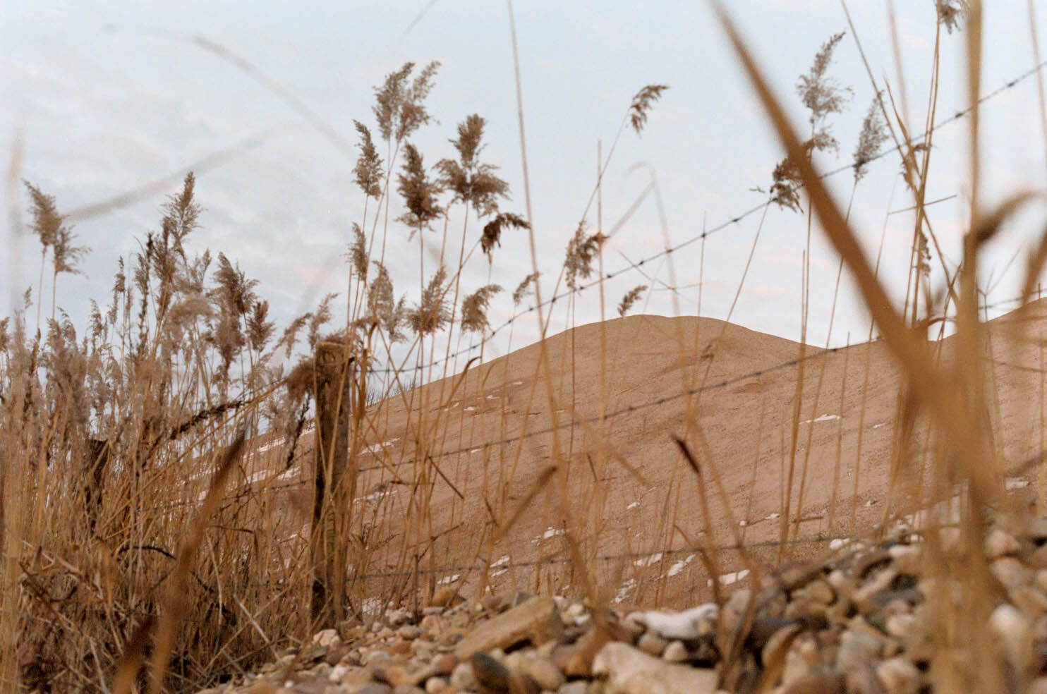
From my mid-teens to around 25, roughly a third of my life, I spent my time taking photos. It started with the teen spirit of social photography, leading to the joy of discovering the effects of light and editing software. It evolved when I got into film photography and became an art student. It was fun. Afterwards, I worked as a commercial photographer for a few years until I got bored of it. It was time for me to move on and try something new.
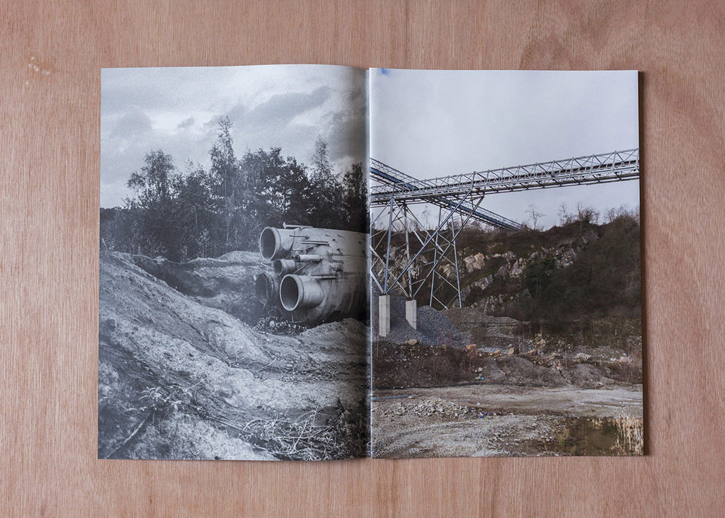
Antoine Grenez and Leo Seyers
8 sheets in-folio, digital offset on Eco Cyclus 130gr
What about websites? I started late. My sister asked me to make her’s website. She took care of the design. I built it using a no-code platform called Webflow. She and I were super happy with the results but I ended up frustrated when I couldn’t fully understand how things were behaving. Concepts such as relative and absolute positioning, z-index.. if you’ve ever tried to learn HTML and CSS, this should bring back memories.
I had no much prior knowledge apart from a summer camp as a kid when I was introduced to PHP and mySQL to build a forum from scratch. Another memory, distant but powerful, from a visit to my parents’ friends. Their children were hacking each other through the terminal. It all felt very esoteric but captivating.
I decided to update my knowledge and started anew with coding, building the same website again from scratch. Then things escalated quickly and I jumped from one online course to the other, starting with SCSS (writing styles on steroids), Javascript (everything about interactivity) and WordPress (the content backbone).
Fast forward to now after roughly 7 years of experience. I can say I was lucky, the demand remains strong. I am grateful for all the trust my friends and colleagues put in me. Without whom I would not have been able to do what I am passionate about, to be able to work with local cultural actors without compromising my beliefs.
Photographers’ Archive
I spent quite some time over the years meeting photographers, talking to them, and designing platforms that they can manage independently.
Most of the time a photographer’s website is basically a portfolio. A tool to showcase, archive, diffuse, promote or sell your work. But there’s so much more to it to make the whole experience of visiting a website to make it a journey. I like to think of web design to be a spatial art in itself, much like book design or scenography. To this regard each site is unique and reflects its author personality and stance.
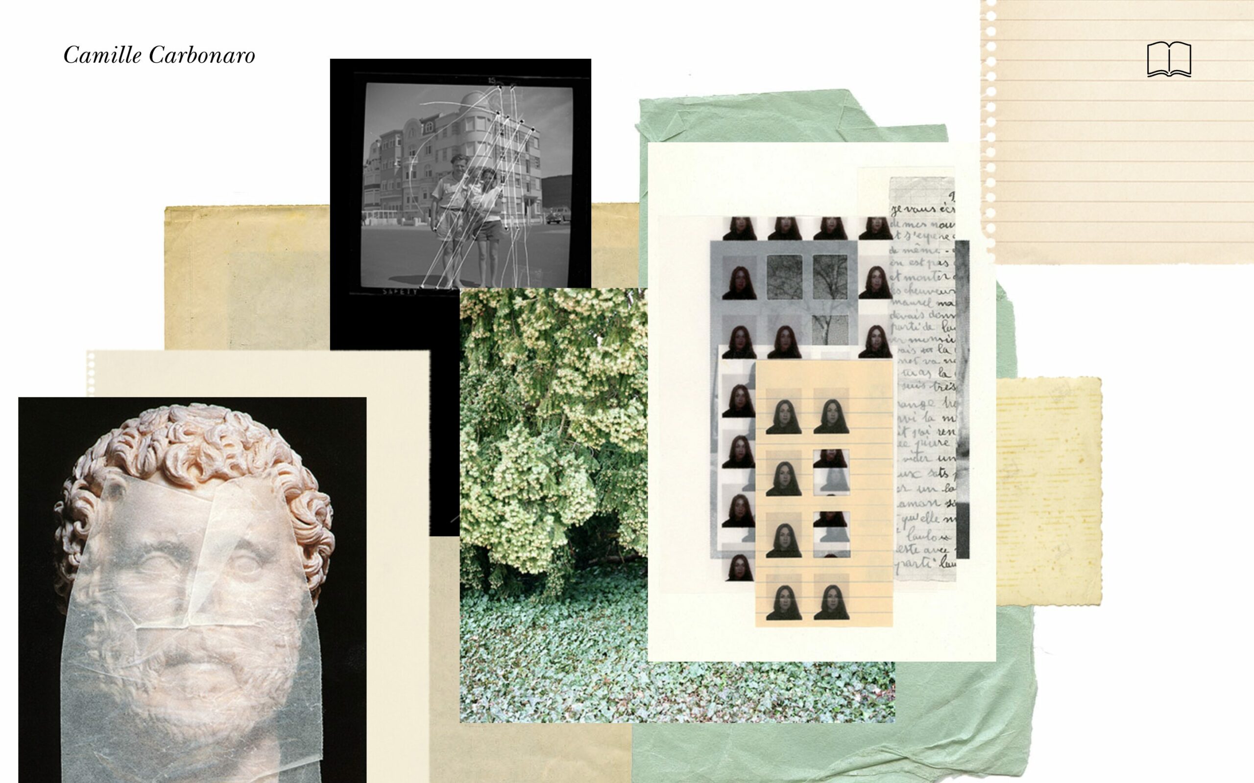
Camille Carbonaro
camillecarbonaro.com (2018)
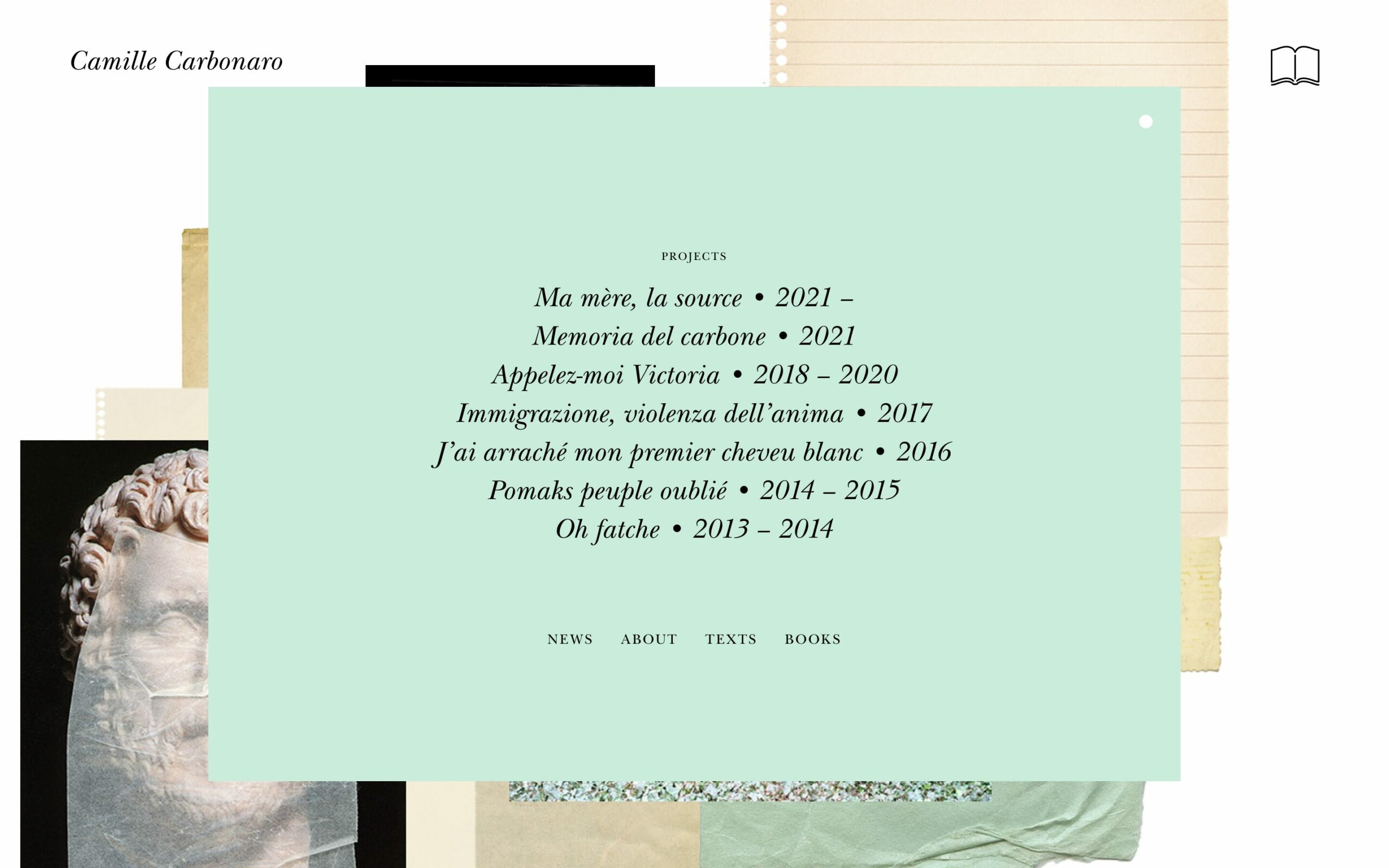
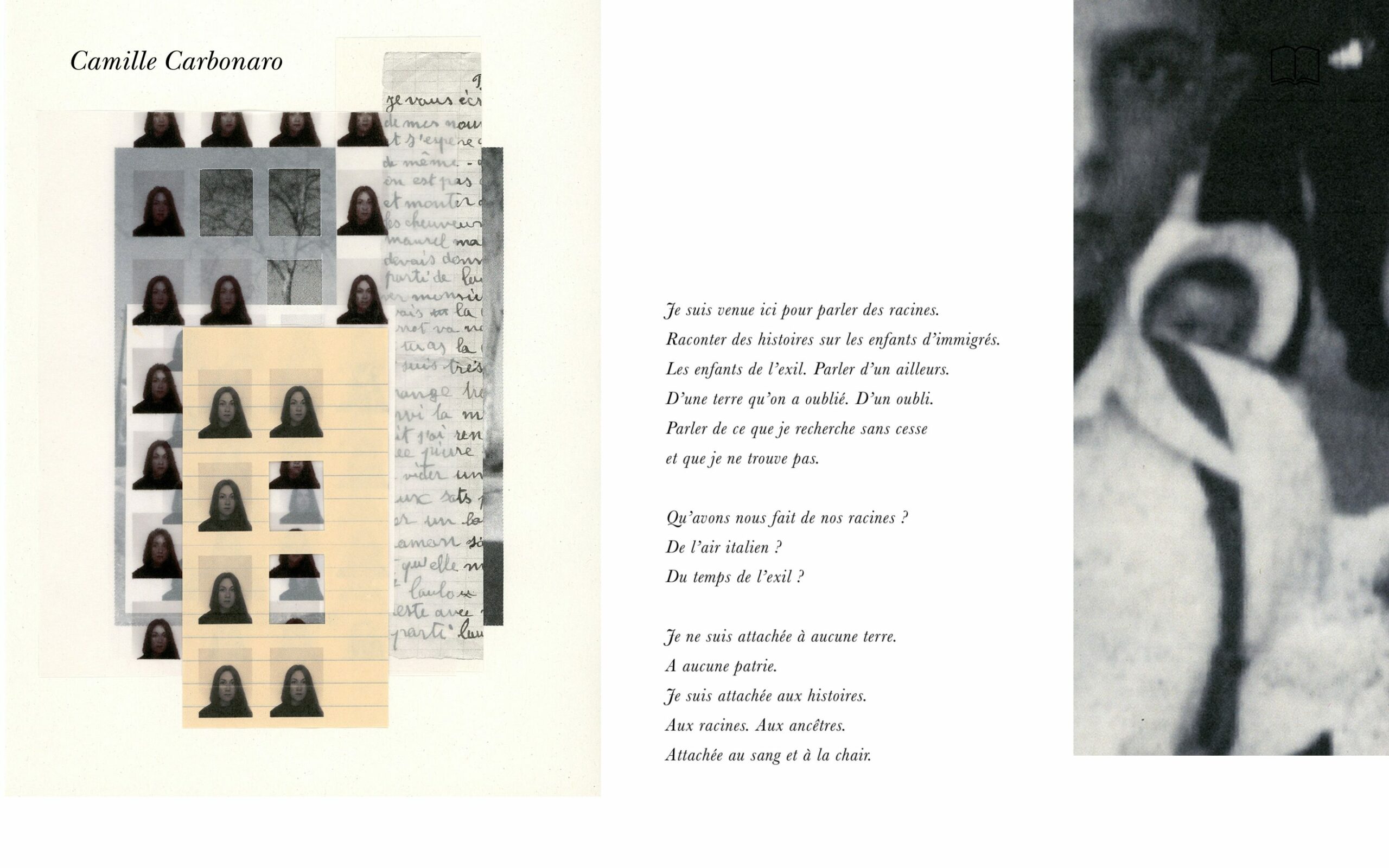
Back when it all began, Camille was one of the first photographers to trust me and envision her personal website. Through the various subjects she tackles, storytelling is a central mechanism in the image and text fragments she arranges. In similar fashion, visitors are invited to recompose the images on the homepage to create their own narratives.
Among Camille’s many talents and initiatives in the local photography scene, I do recommend that you take a look at her publishing house Macaroni Books – also made by yours truly.
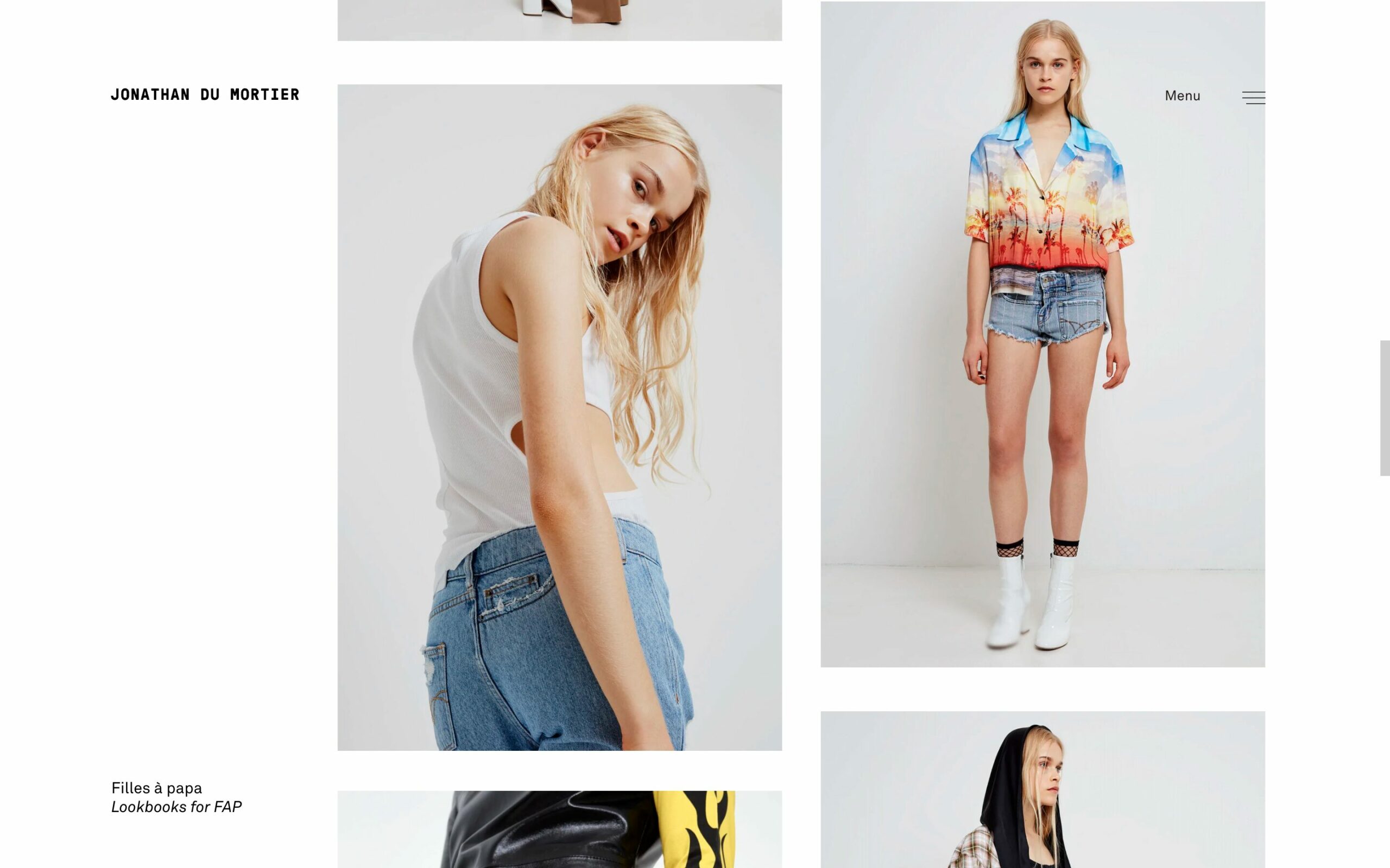
Jonathan Du Mortier
jonathandumortier.com (2019)
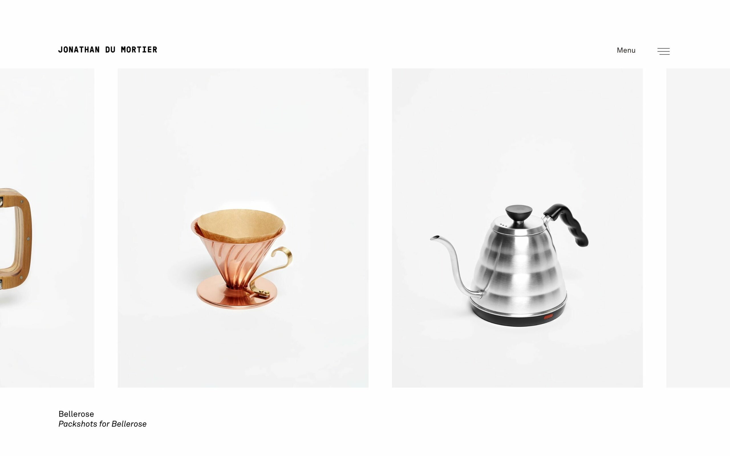
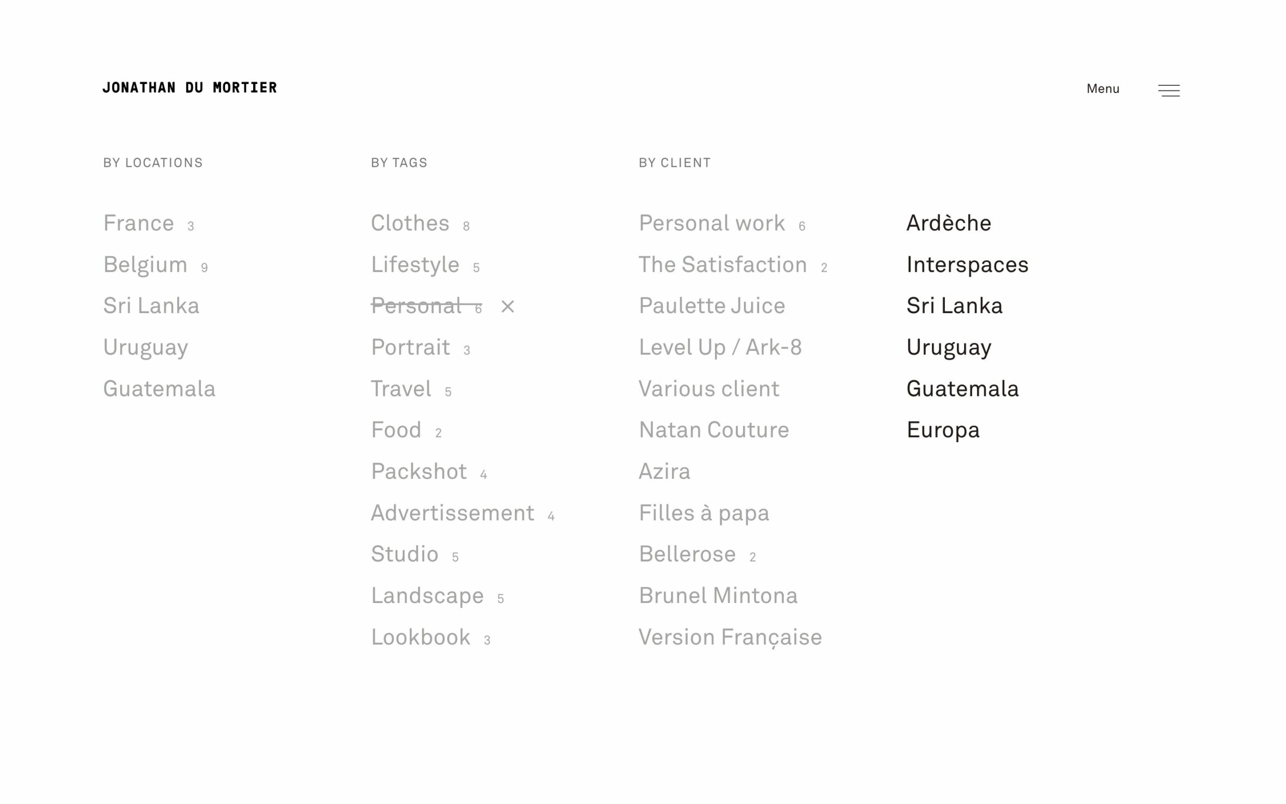
Jonathan’s website is a business card with a minimal, elegant look for his commercial work. While the commissioned work is the highlight of its portfolio, we made sure there was space for his personal work and its willingness to travel — combining business with pleasure.
Massao Mascaro
massaomascaro.com (2019)
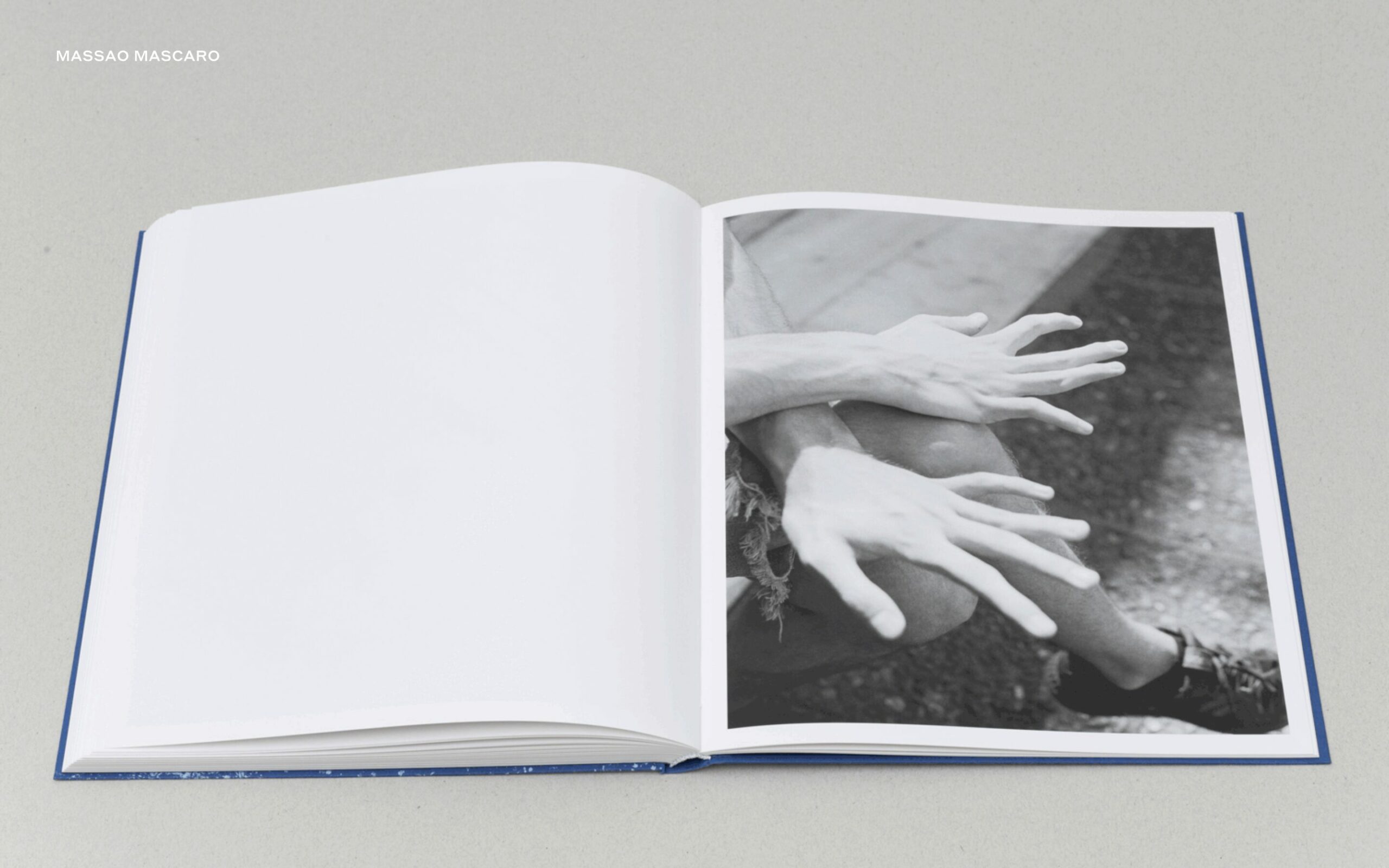
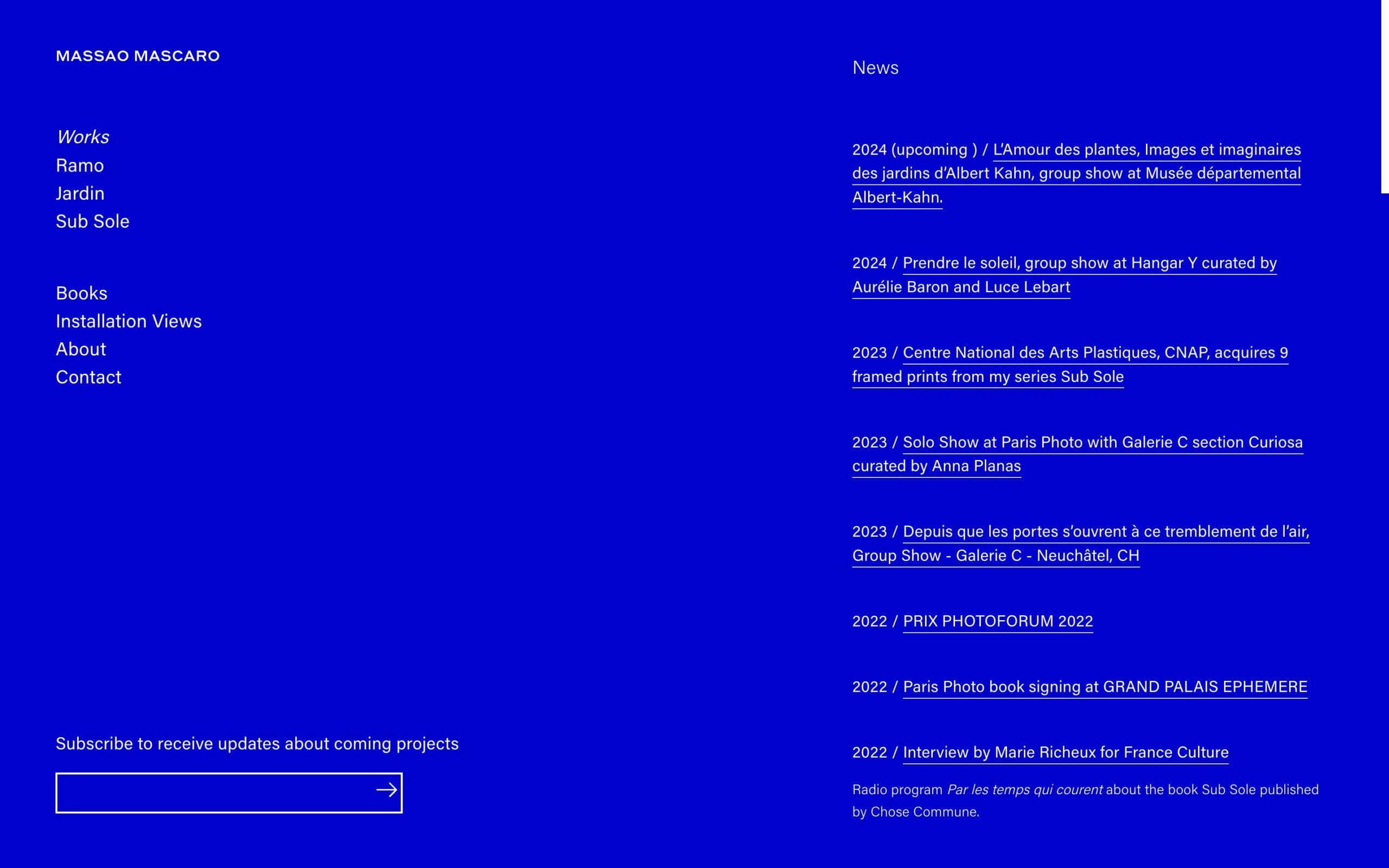
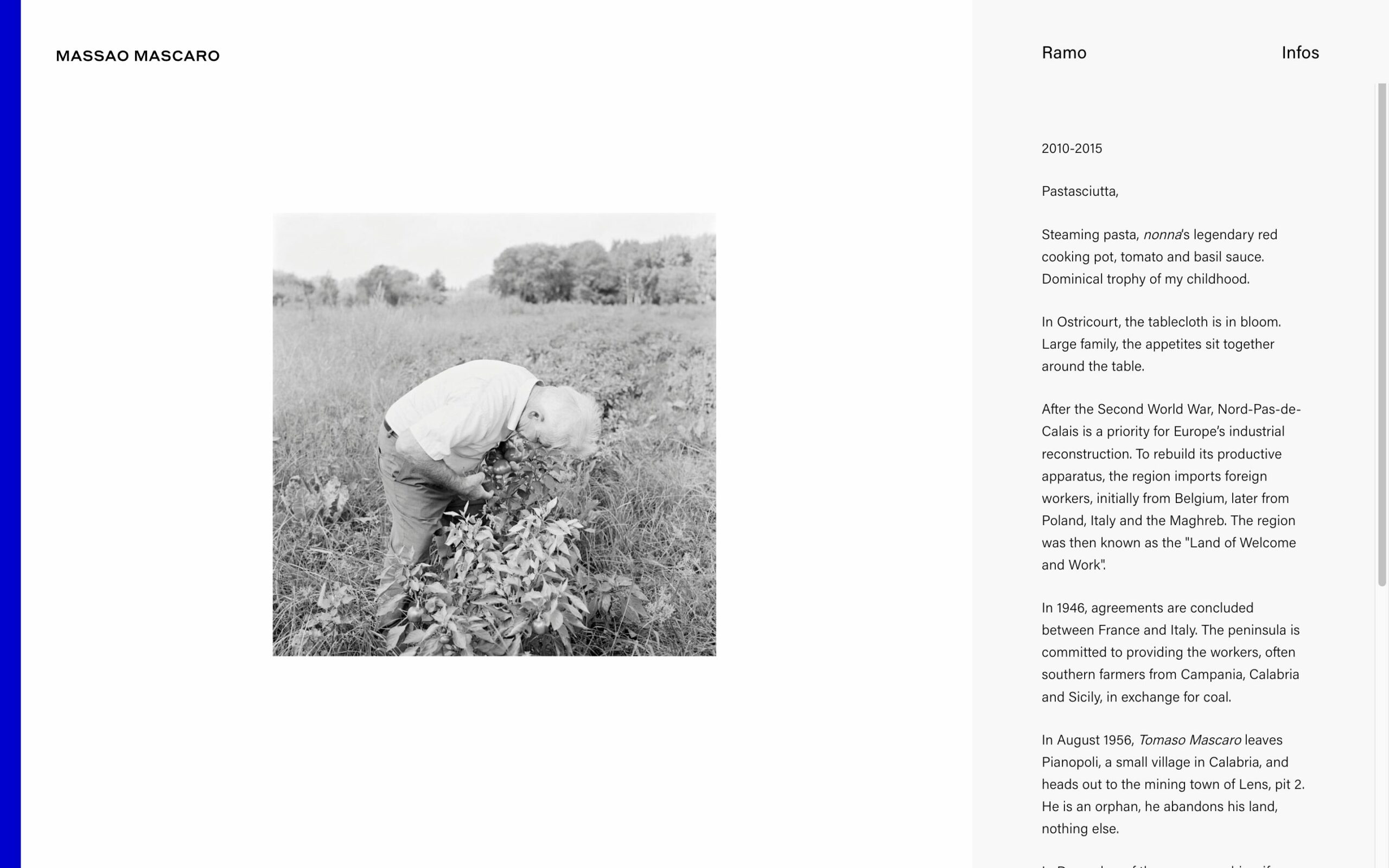
A few years ago, I was commissioned to create a tailored website for Massao. I’m still very pleased with the result, which uses simplicity to support its subtle, iconic black and white images with a touch of blue.
Anna Muchin
annamuchin.com, 2021
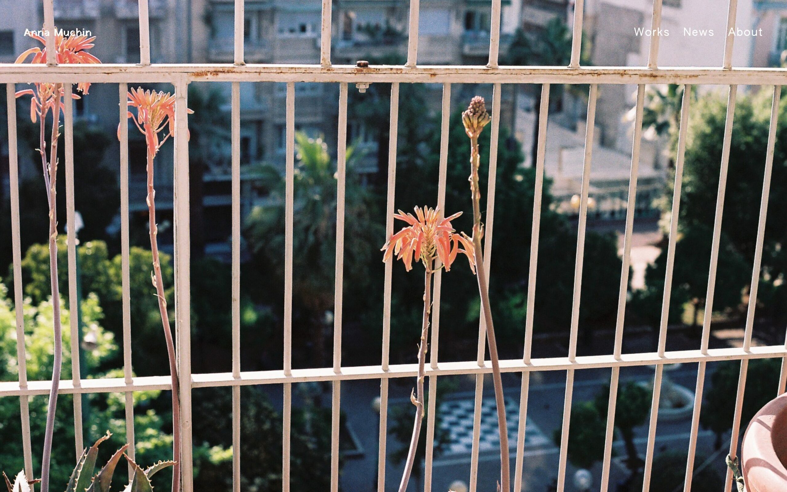
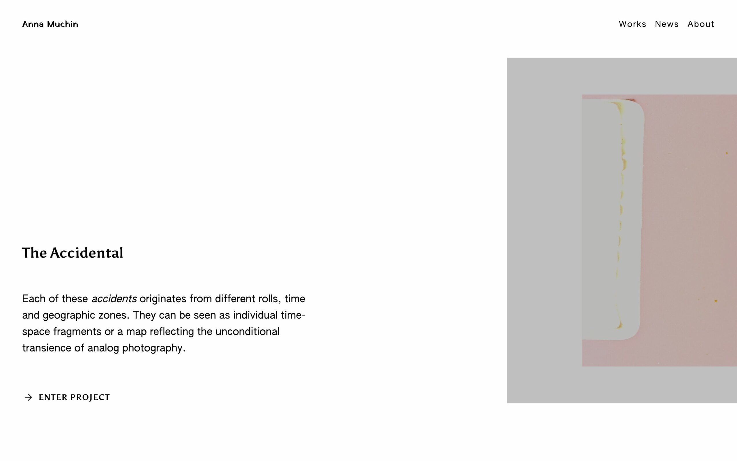
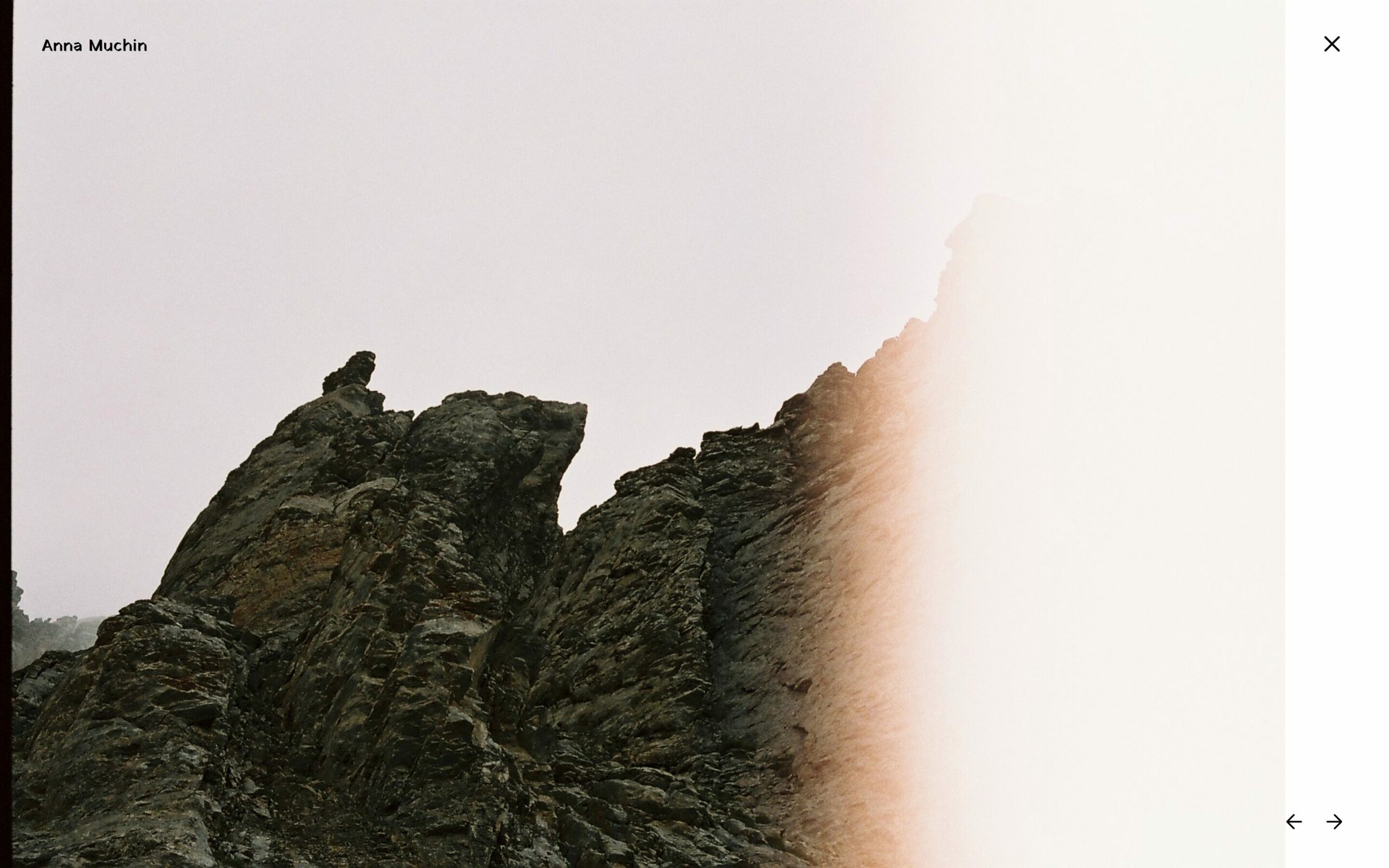
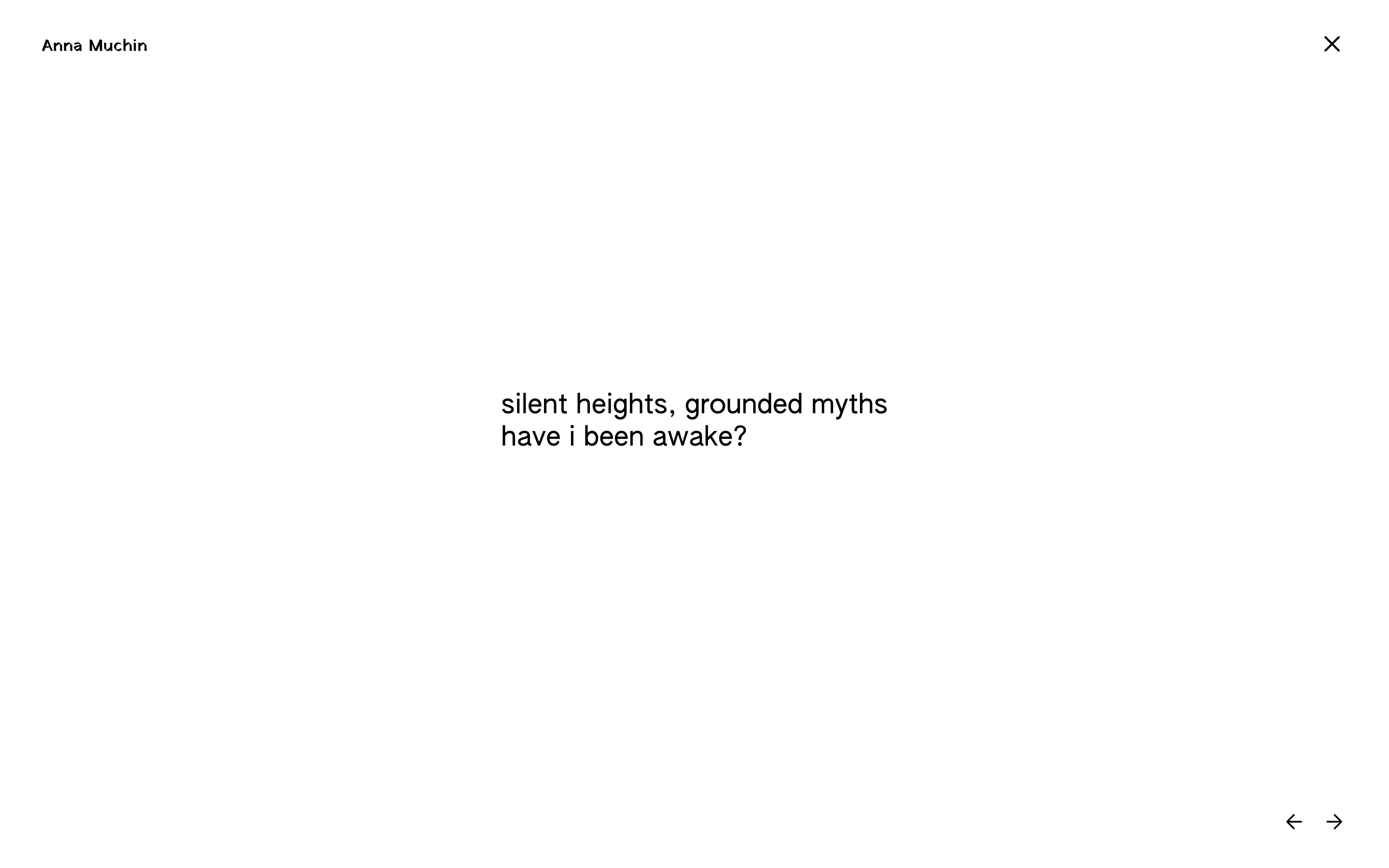
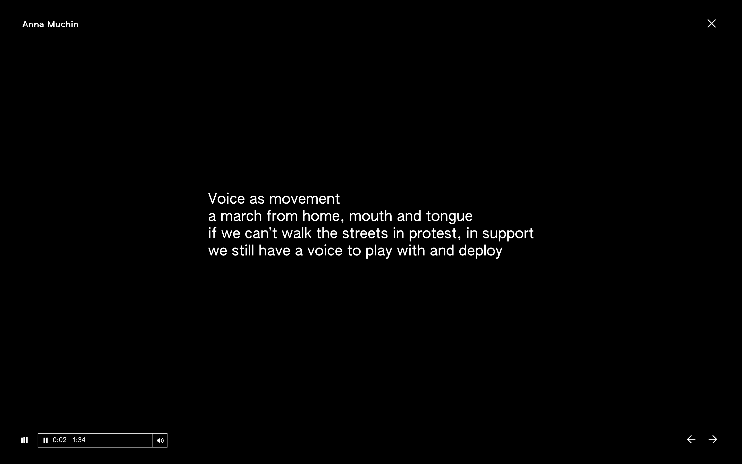
A multifaceted, committed artist, Anna’s work is grounded both in poetry and politics. For her portfolio, we sought to create a rich experience that showcases the many forms of her work through visual, textual and sound materials.
Victor Pattyn
victorpattyn.com, 2021
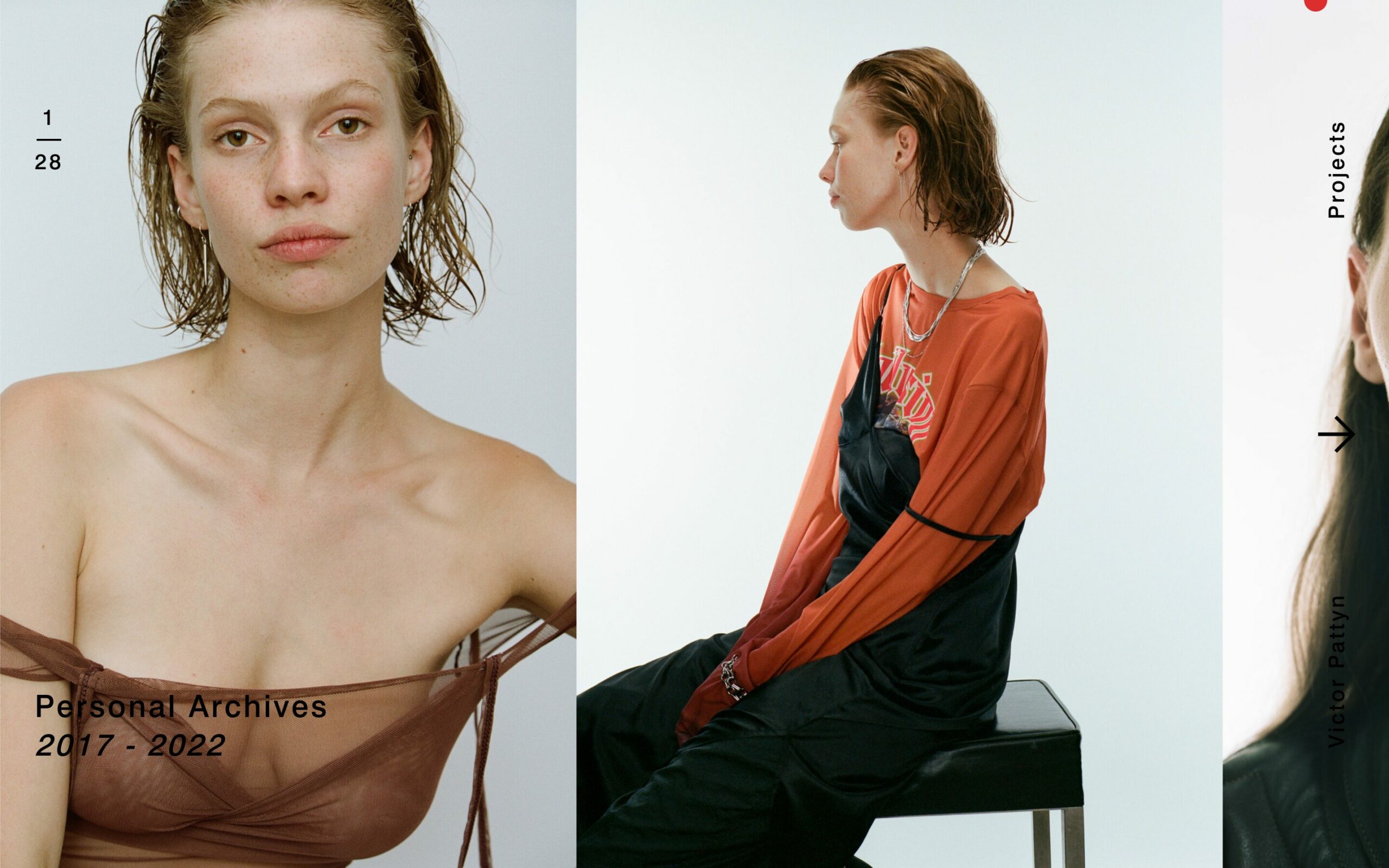
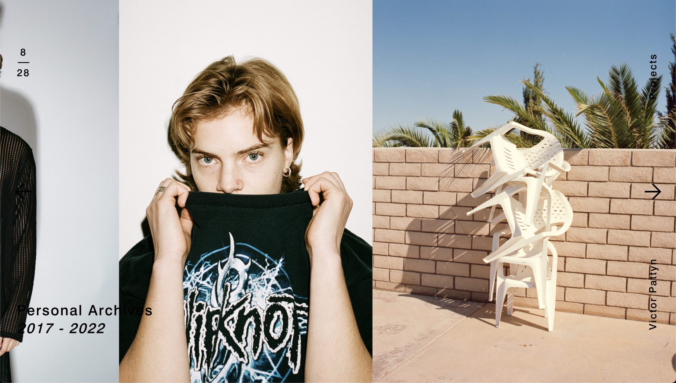
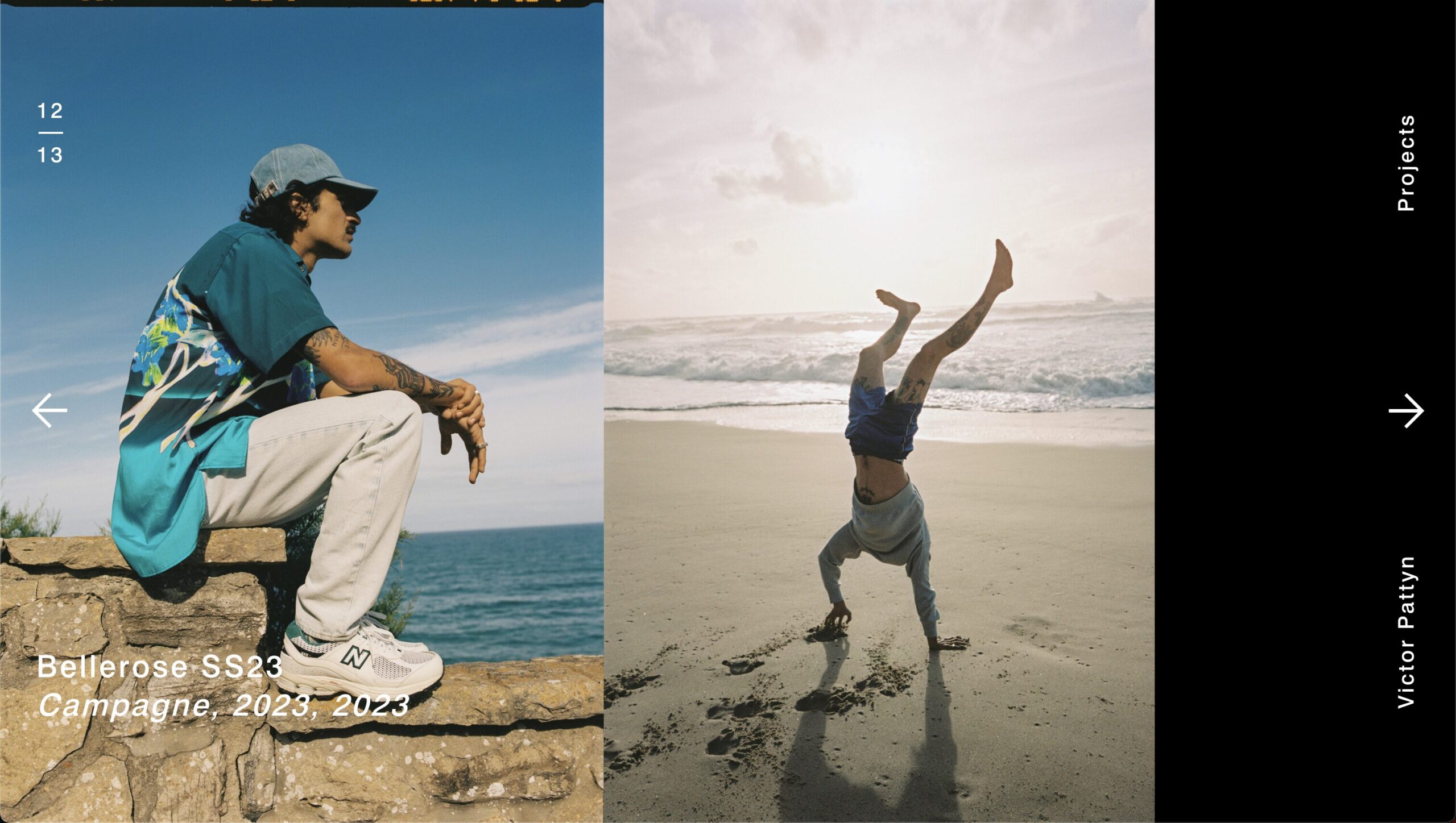
The second version of Victor’s website is the fruit of hours of reflection and testing to develop a fluid, uncluttered interface to showcase his unique work. The search for purity and attention to detail are at the heart of the design and user experience.
Sarah Lowie
SARAHLOWIE.COM, 2022
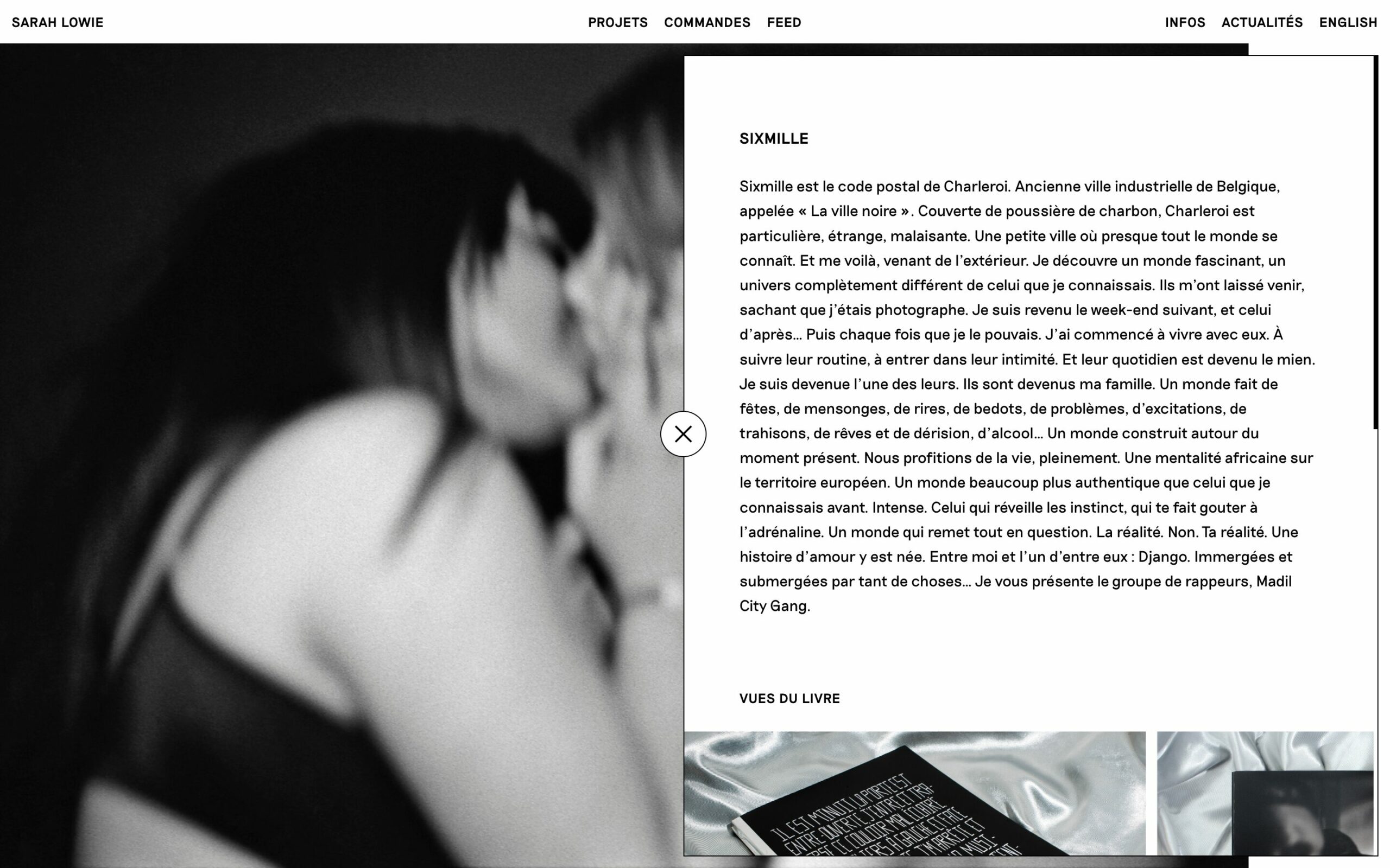
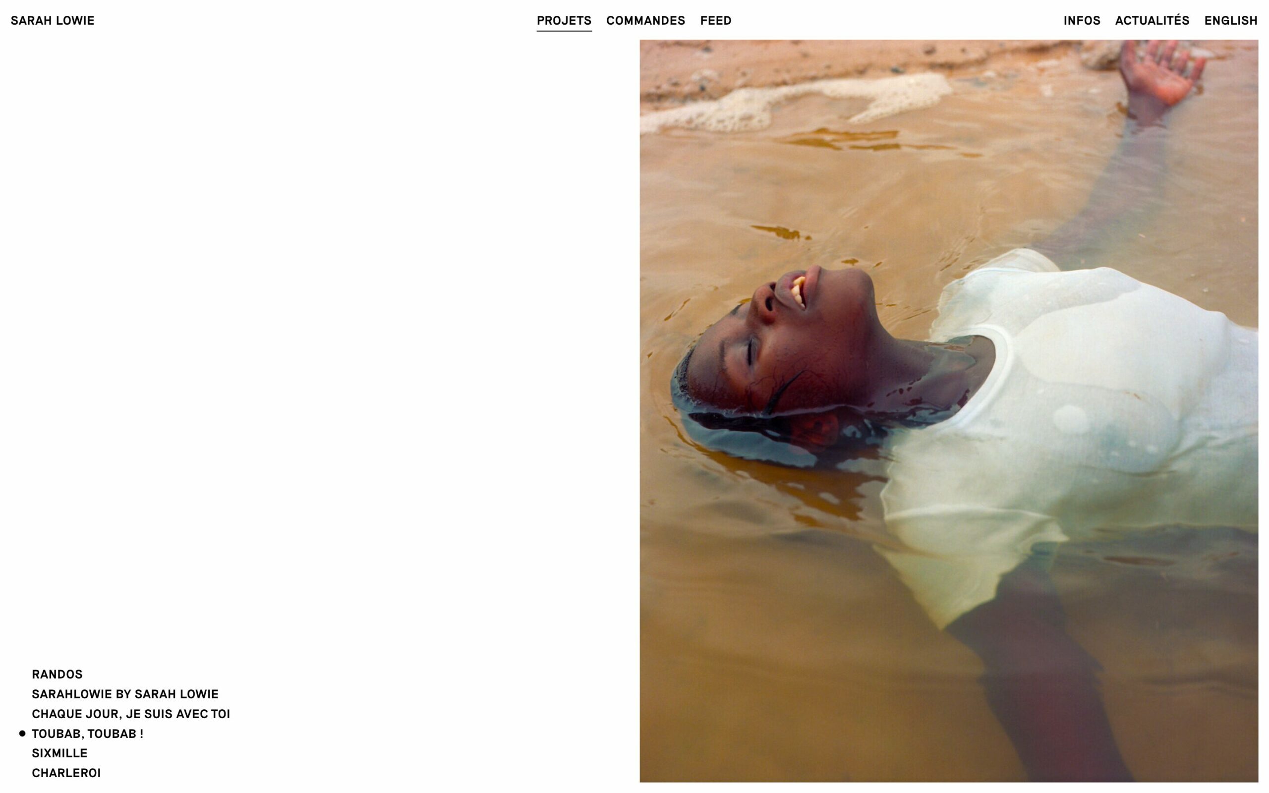
Latest project to conclude this selection, Sarah’s site is the perfect demonstration of the multiplicity of the work of an artist photographer: composed of personal projects (small and large scale), commissioned work and then other images, the one who does not want to be reduced to any form of classification but who wants to be shown.
Studio Updates
When talking of life projects, the distinction between design and bricolage becomes blurry. The everyday designer is always working with a set of constraints that do not only belong to the internal logic of design, but to its presence in the world. Everyday designers design their life project from the rubble of what is already there — their activities and career included.
What Design Can’ Do, Essays on Design and Disillusion
Silvio Lorusso, Set Margin’s #26
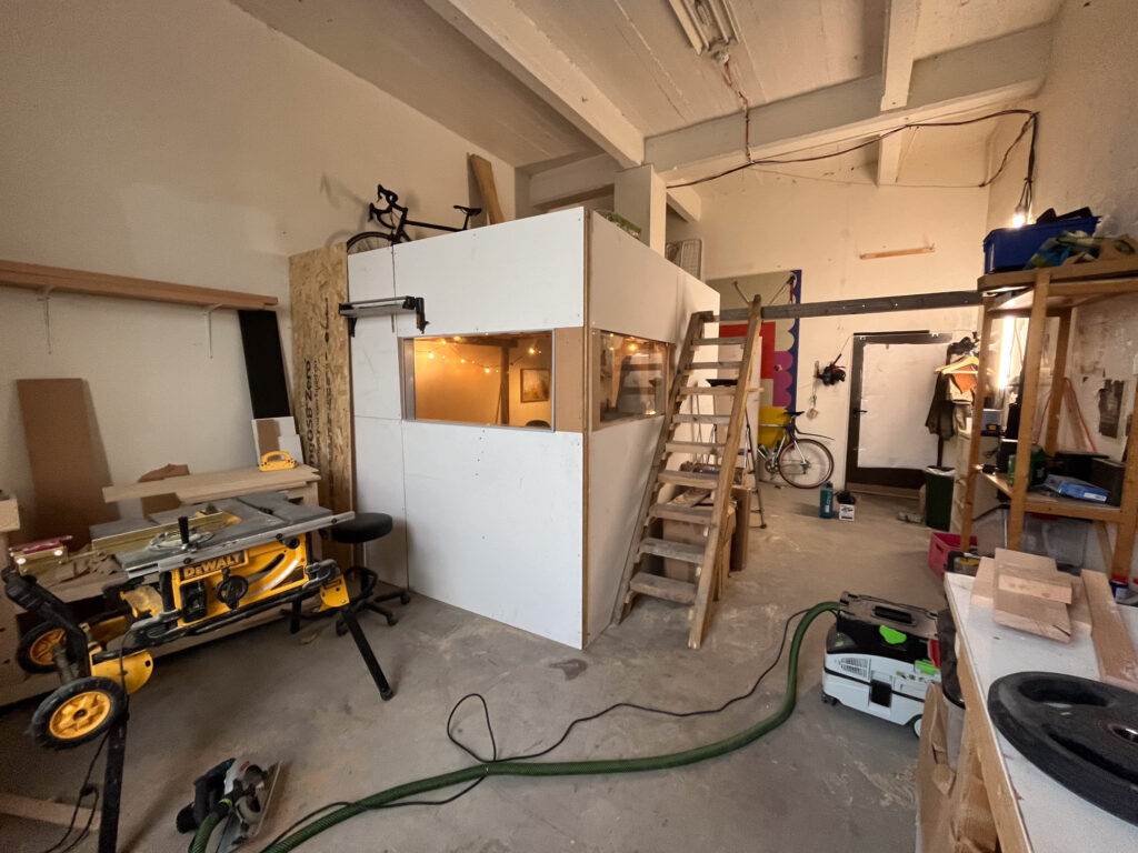
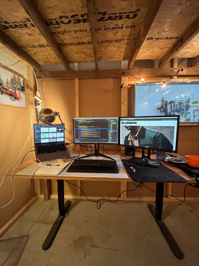
It’s now been three months since I moved in, and I’m fully settled in and working daily from my cabin. As much as I’ve loved working from home all these years, having my own space is an inexhaustible source of experimentation and joy. Add to that the best neighbors and you’re juiced!
Come and say hi! 👽
